
You find software easy when it has a clear, simple, and predictable interface that guides you naturally through tasks without overwhelming you. When icons are intuitive, labels are clear, and it remembers your preferences, your experience feels seamless. Frustration arises from confusing design, hidden features, and inconsistent layouts that force you to think more than act. If you want to discover how good design makes all the difference, keep exploring these key factors.
Key Takeaways
- Intuitive and predictable user interfaces that follow consistent design patterns reduce user confusion.
- Clear layout and straightforward labels help users navigate and complete tasks efficiently.
- Thoughtful UX features like shortcuts, tooltips, and personalization enhance overall satisfaction.
- Avoiding unnecessary complexity and hidden features minimizes frustration during use.
- Designing to meet user expectations and reducing cognitive load promotes a seamless experience.
Have you ever wondered why some software feels intuitive and effortless to use, while others frustrate you from the start? It all comes down to the user interface and the overall user experience. When software is designed well, you don’t have to think twice about how to navigate it—you just know where to click, what to do next, and how to find what you’re looking for. That seamless flow makes using the software feel natural, almost like it’s an extension of your thoughts. But when the user interface is cluttered, confusing, or inconsistent, frustration quickly sets in. You find yourself wasting time trying to figure out how to perform simple tasks, which ruins the experience altogether.
A well-designed interface makes software feel natural, effortless, and a true extension of your thoughts.
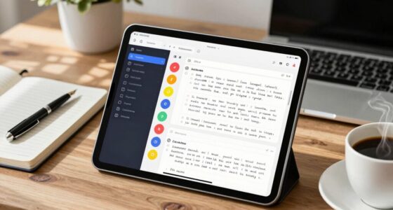
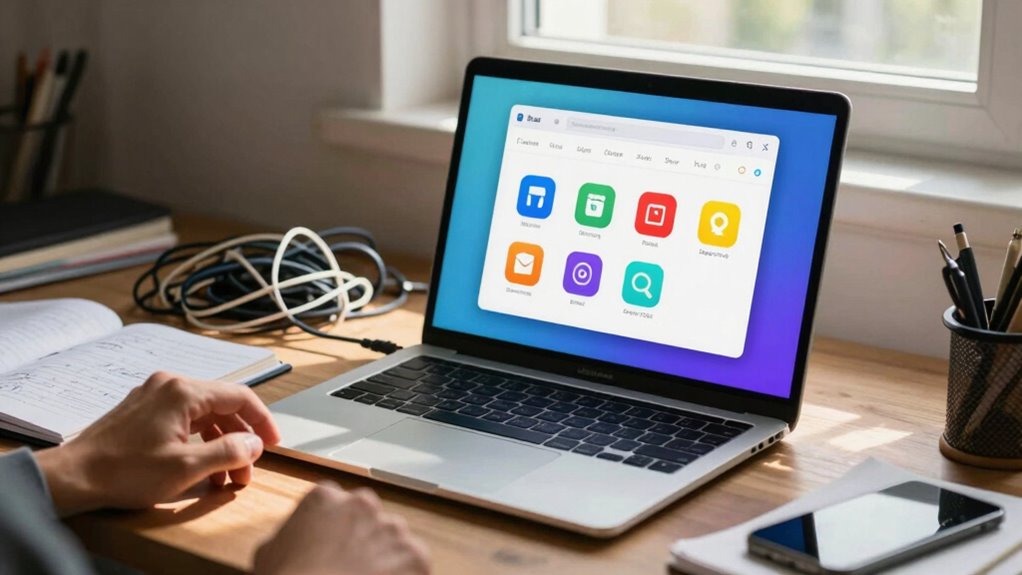
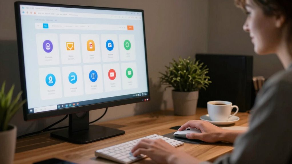
A good user interface is simple, clean, and predictable. It guides you through your tasks without overwhelming you with options or unnecessary information. Think about how often you’ve used apps that have a clear layout—buttons are logically placed, menus are easy to find, and labels are straightforward. When this is done right, it minimizes your cognitive load, allowing you to focus on what you want to accomplish rather than how to navigate the tool. On the other hand, a poor user interface bombards you with confusing icons, hidden features, or inconsistent design choices. It’s like trying to find your way through a maze with no map, which quickly becomes exhausting and discouraging. Design consistency plays a crucial role in ensuring users feel confident and comfortable.
User experience is equally vital. It’s not just about how the software looks but how it makes you feel and how well it supports your goals. A positive user experience keeps you engaged, makes tasks feel quick and effortless, and often includes helpful features like tooltips, shortcuts, or personalized settings. When these elements are missing or poorly implemented, you might feel like the software is fighting against you. It’s frustrating when the system doesn’t remember your preferences or when workflows are unnecessarily complicated. Good user experience anticipates your needs, reduces your effort, and provides a sense of satisfaction with each interaction.
In contrast, bad user experience can make even the most powerful software seem useless. It’s not just about aesthetics but about how well the design aligns with your expectations and natural workflows. When software feels easy, it’s because the user interface is intuitive and the overall experience supports you effortlessly. When it’s frustrating, it’s because those design elements are lacking or poorly executed. Ultimately, creating software that feels easy to use requires a thoughtful balance of clear user interface design and an empathetic understanding of the user experience.

Designing the User Experience of Game Development Tools
As an affiliate, we earn on qualifying purchases.
As an affiliate, we earn on qualifying purchases.
Frequently Asked Questions
How Does User Familiarity Impact Software Usability?
Your familiarity with software is vital to its usability. When you develop muscle memory, tasks become quicker and smoother, reducing frustration. Intuitive navigation plays an essential role, helping you find features effortlessly without constant guessing. As you become more familiar, the software feels natural, allowing you to focus on your work instead of figuring out how to use it. This familiarity boosts confidence and overall satisfaction, making your experience more efficient and enjoyable.
What Role Does Aesthetic Design Play in User Experience?
Like a sleek, vintage typewriter, aesthetic design shapes your overall experience. Visual harmony in software creates a pleasing interface, guiding your eyes smoothly and reducing confusion. Emotional appeal connects you emotionally, making interactions feel intuitive and enjoyable. When design is thoughtfully crafted, it fosters trust and satisfaction, transforming complex tasks into effortless actions. Aesthetic choices aren’t just about looks—they directly influence how easy and engaging you find the software.
Can Customization Options Improve Software Ease of Use?
Yes, customization options can improve software ease of use by enhancing interface flexibility and offering personalization features. When you can tailor the interface to your preferences, you navigate more intuitively and efficiently. Personalization features let you adjust layouts, shortcuts, or themes, reducing frustration and streamlining your workflow. This sense of control makes the software feel more user-friendly, ultimately boosting your overall experience and satisfaction.
How Does Software Performance Influence User Frustration?
A stitch in time saves nine, and that’s true for software performance. When you experience consistent performance and minimal response latency, you’re less likely to get frustrated. Slow or unpredictable responses break your flow, making tasks feel burdensome. Smooth performance reassures you that the software is reliable, reducing frustration. Prioritizing performance consistency and reducing response latency keeps your experience seamless, making software feel much easier to use.
What Is the Impact of Onboarding Processes on Usability?
Your onboarding process greatly impacts usability by guiding users smoothly through features like gesture controls and accessibility features. When onboarding is clear and intuitive, you’re more likely to understand how to use gesture controls effortlessly and benefit from accessibility features. Conversely, complex or confusing onboarding can cause frustration, making users feel lost. A well-designed onboarding experience guarantees users feel confident, engaged, and capable of maximizing the software’s potential from the start.

AllrangeKit 13-in-1 STI (STD) Test with At-Home Urine Sample Collection Kit — Secure Mail-in Sample for CLIA Lab Testing, Discreet, Easy to Collect, Fast Results in 1-2 Days
ALL RANGE — Get tested for different causes of sexually transmitted infections (STIs) all in one test: Bacterial,…
As an affiliate, we earn on qualifying purchases.
As an affiliate, we earn on qualifying purchases.
Conclusion
So, next time you’re faced with software that feels like steering a labyrinth, remember—it’s about design, clarity, and how intuitive it is. Think of it as the difference between a well-packed carriage and a clunky chariot; one gets you where you need to go smoothly, the other leaves you stranded. In the end, good software should make your life easier, not turn it into a quest for the Holy Grail. Keep those principles in mind, and you’ll always find your way.

Laws of UX: Using Psychology to Design Better Products & Services
As an affiliate, we earn on qualifying purchases.
As an affiliate, we earn on qualifying purchases.
![Free Fling File Transfer Software for Windows [PC Download]](https://m.media-amazon.com/images/I/41Vq6ZqHfjL._SL500_.jpg)
Free Fling File Transfer Software for Windows [PC Download]
Intuitive interface of a conventional FTP client
As an affiliate, we earn on qualifying purchases.
As an affiliate, we earn on qualifying purchases.