
Software feels easy when its interface is clear, intuitive, and simple to navigate, with logical menus and prominent buttons that reduce your thinking effort. When actions respond quickly with helpful feedback, you feel more confident and engaged. On the other hand, cluttered layouts, hidden options, or laggy responses make it frustrating. Good design anticipates your needs and balances features with simplicity. Keep exploring to discover how to improve your user experience further.

Get the latest gadgets delivered free with Prime
- Fast, free delivery on millions of items
- Prime Video, Amazon Music and more included
- Member-only deals all year
Key Takeaways
- Clear, intuitive interfaces reduce user effort and confusion, making software feel easy to navigate.
- Quick, meaningful feedback reassures users and prevents frustration during interactions.
- Consistent design patterns help users learn and predict software behavior effortlessly.
- Overly complex features or cluttered layouts overwhelm users, causing frustration.
- Anticipating user needs and simplifying workflows enhance overall ease of use.
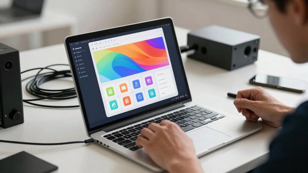
Software can feel intuitive or frustrating depending on how well it aligns with your expectations and needs. At the core of this experience is the user interface, which acts as the bridge between you and the software’s functions. If the interface is clear, straightforward, and easy to navigate, you’re more likely to find the software helpful rather than frustrating. Conversely, a cluttered or confusing user interface can make even simple tasks feel like a chore. When designing software, developers focus heavily on the user experience because it determines whether users stay engaged or abandon the tool altogether.
A key factor that influences how you perceive software is how well the user experience is crafted. Good user experience considers your goals, workflows, and how you naturally interact with the system. When the software anticipates your needs and minimizes the steps required to complete tasks, you feel more in control. For example, logical menu layouts, prominent buttons, and consistent design patterns reduce cognitive load and help you find what you need quickly. On the other hand, if the user interface is inconsistent, with hidden options or unclear labels, you might waste time searching or become confused about what to do next. This confusion often leads to frustration, making the software feel like a hurdle rather than a helpful tool.
Your perception of ease or difficulty also depends on how responsive and smooth the software feels. If commands are executed promptly, and transitions are seamless, the experience is more enjoyable. But laggy, sluggish interactions can break your concentration and make you question whether the software is reliable. Clear feedback, like visual cues or confirmation messages, reassures you that your actions are recognized, further enhancing the user experience. When these elements are missing, you might feel unsure whether your input registered, leading to repeated attempts and annoyance. Additionally, consistent design principles can significantly improve how intuitive the software feels, making it easier to learn and use efficiently. A well-implemented usability standard also ensures that the software is more accessible and easier to adapt to different user needs, enhancing overall satisfaction.
Furthermore, when software adheres to established usability standards, it becomes more accessible to a wider range of users, reducing barriers to effective use. Ultimately, the balance between a well-designed user interface and a thoughtful user experience determines whether software feels easy or frustrating. Good software respects your time, understanding your needs, and streamlining your interactions. It minimizes complexity without sacrificing functionality. Poorly designed software, however, neglects these principles, making you work harder to achieve simple goals. When the interface is unintuitive, and the overall experience doesn’t match your expectations, frustration builds quickly. Conversely, when the design aligns with your natural behaviors and needs, using the software becomes almost seamless, transforming a potentially frustrating experience into an efficient, even pleasurable one.
As an affiliate, we earn on qualifying purchases.
Frequently Asked Questions
How Does User Interface Design Impact Software Usability?
User interface design impacts software usability by creating a clear visual hierarchy, guiding you effortlessly through tasks. When the layout emphasizes important features and minimizes clutter, you find it easier to navigate. Accessibility features, like adjustable font sizes and screen reader compatibility, make the software usable for everyone. A well-designed UI reduces confusion, saves time, and enhances your overall experience, making the software feel intuitive and accessible.
What Role Does User Feedback Play in Software Development?
User feedback plays a vital role in software development by guiding improvements and identifying pain points. You should actively listen to your users and incorporate their input into an iterative development process. This helps you refine features, fix issues, and enhance usability, making the software feel more intuitive and satisfying to use. Continuous user feedback guarantees the development stays aligned with user needs, ultimately creating a better overall experience.
How Important Is Performance Speed in User Satisfaction?
Speed is the heartbeat of user satisfaction, and response time is your software’s pulse. When data processing is swift, you feel in control, like everything’s flowing seamlessly. Conversely, delays create frustration, turning smooth navigation into a sluggish crawl. You crave instant feedback, and your experience hinges on how quickly your software processes data. Fast performance isn’t just a feature; it’s the foundation that keeps users engaged and happy.
Can Customization Options Reduce User Frustration?
Yes, customization options can reduce your frustration by giving you more personalization options and user control. When you can tailor the software to fit your needs, you feel more empowered and less constrained. This flexibility allows you to streamline your workflow and avoid unnecessary steps, making the experience more intuitive and satisfying. Overall, offering customization helps create a more user-friendly environment that minimizes frustration and boosts your confidence in using the software.
How Does Software Onboarding Influence Initial User Experience?
Did you know that a strong user onboarding process can boost user retention by up to 50%? Your first impressions matter greatly; a smooth onboarding experience helps users understand features quickly and feel confident using the software. When onboarding is clear and engaging, it sets a positive tone, making users more likely to stick around and explore. Poor onboarding, on the other hand, can lead to frustration and early abandonment.
As an affiliate, we earn on qualifying purchases.
Conclusion
Ultimately, software feels easy or frustrating based on how well it aligns with your expectations and needs. When interfaces are intuitive and tasks are streamlined, you’re more likely to feel satisfied. Remarkably, a study found that 88% of users are less likely to return to a website after a bad experience. So, investing in user-friendly design isn’t just about convenience—it’s about building trust and encouraging ongoing engagement. Keep usability at the forefront, and your software will stand out.
feedback indicator icons for software
As an affiliate, we earn on qualifying purchases.
As an affiliate, we earn on qualifying purchases.
As an affiliate, we earn on qualifying purchases.
Halloween Picks
halloween
As an affiliate, we earn on qualifying purchases.